A2 MEDIA STUDIES (CIE)
Click ALL the bars below


DIGIPAK
RESEARCH


1. RIHANNA - UNAPOLOGETIC


Rihanna's Unapologetic album cover, is showing her with writing in her body and covering her face, this makes the album cover seem mysterious and make the audience want to know more about the songs that are included in it. Having an eye-catching and intriguing album cover is ideal so the audience buys the album.
For the back of the album Rihanna has used another foto of her but in black and white which make it contrast with the front. She also puts the names of the songs in the same font as the front cover, giving it something to reference to.
I am going to get ideas from this Digipak, for example the use of first a photo in colour and them a photo in black and white.
The PARENT ADVISORY logo, it is used to help parents recognise when inappropriate content might be present.
The typography used is present in all the digipak, in the front and in the back, which makes it link in between one and other. Additionally, she is using the names of all the song names from the back of the album in the front.
2. A GREAT BIG WORLD -
IS THERE ANYBODY OUT THERE?

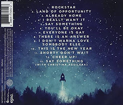
This front cover is a more simple one as it is not a photo and it is animation. This makes it seem more magical and more with the theme of the song and more like the artists genre. Additionally the image of the child looking at the full moon makes it fell more mystical.
In the front of the album it contains the name of the band (A Great Big World) and the name of the album which is 'Is there anybody out there?' . The typography is the same used for the title and name but it is also the same as the one used for the back of the album
In the back of the album the image shown is the same landscape as the one in the front but looking in the opposite direction which makes sense as it is the back and the front of the album. Also the typography's link together which make the album seem more organised and more appealing for the audience.